


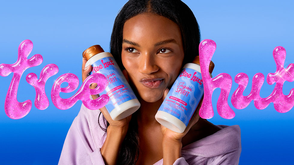
Tree Hut Rebrand
Branding, Packaging Design
Overview:
Tree Hut is a well-loved body care brand known for its vibrant scrubs and playful scents, but its packaging and logo had grown outdated and inconsistent across products. To strengthen brand recognition and align with its fun, feminine personality, the rebrand aimed to modernize the visual identity while bringing greater cohesion to the full product line.
The Team:
Strategy: Hailey Kirkpatrick
CD/AD: Kerrie Heckel, Alejandro Aguilar Canela,
Micky Ogando
Design Lead: Kaleb Sindac
Designers: Elisabeth Klein, Morgan Unroe,
Frida Garcia-Berriochoa
Mechanical Designers: Kaitlyn Toney, Jamie Kepko, Roxanne Ratliff
Awards/Features:
Challenge:
Although Tree Hut had strong shelf presence, many consumers couldn’t recall the brand name or logo. Competing brands leaned toward minimal, neutral designs, creating an opportunity for Tree Hut to confidently embrace color and femininity. The challenge was to build a cohesive, ownable system that balanced bold personality with flexibility across multiple scent families.
Execution:
Collaborating with a team of designers and art directors, I helped develop a unified packaging system; designing templates, illustrated backgrounds, and lockup styles. Each scent family received its own visual direction and color story; I led the art direction for the fruity category, setting the tone for the rest. We delivered key scent designs and handed off the toolkit for Tree Hut’s in-house team to expand, establishing a look that feels modern, playful, and unmistakably Tree Hut.
Previous Logo
Updated Logo


Packaging
The packaging system was built around distinct scent categories—fruity, gourmand, floral, fresh, glow, and spice and woody—each with its own visual language while remaining cohesive as a whole. Every category features a unique type treatment for its lockups and a dedicated illustration style for backgrounds, allowing individual scents to stand out while still feeling part of a unified system. This approach creates a balance between consistency and variety, making the lineup easy to navigate on shelf while reinforcing a strong, recognizable brand identity.


Custom Letterforms
The “Uncontain Yourself” lockup features custom letterforms designed to feel fluid, expressive, and unmistakably Tree Hut. Inspired by the soft, goopy textures of the product and the curves of the logo, each letter flows seamlessly into the next, creating a sense of movement and continuity. While the forms lean playful and organic, legibility remains a priority, striking a balance between personality and clarity. The system was also designed with motion in mind, allowing the type to stretch, melt, and evolve in future animations that bring the brand’s sensorial experience to life.

Super Bowl Spot (2026)
Tree Hut made its Super Bowl debut with the launch of the “Uncontain Yourself” platform, introducing a spot that fully embraced the brand’s chaotic, colorful, and free-spirited energy. The cast featured creators who were early fans of the brand and grew their audiences alongside it, bringing authenticity to the campaign while inviting Tree Hut’s cult TikTok community into the moment. The result was a playful, high-energy introduction that captured both the spirit of the brand and the people who love it.
Brand Illustrations
I developed a foundational set of brand illustrations to serve as the starting point for a scalable asset library. The system centers around fluid, goopy shapes paired with playful, feminine motifs like hearts, stars, butterflies, and flowers. Designed primarily for digital use, these vector graphics are built to work seamlessly with the logo and custom type, creating a cohesive and expressive visual language. Their simple, flexible forms also translate easily into CGI, opening up opportunities for more dynamic and dimensional brand moments.

Spring 2027 Scents
Got a nose for new scents? Take a look!


